Showing posts with label teaching. Show all posts

Friday, October 16, 2009

I'm Teaching an Art Workshop October 24th and 25th in Bend, Oregon

A6 - Atelier 6000 in Bend, Oregon near the Old Mill District is a wonderful printmaking studio with a bright and light energy. It's a wonderful place to practice your art form.
Here's the class info:

When: October 23rd (evening artist talk); October 24th and 25th
Where: 389 SW Scalehouse Ct., Suite 120, Bend, OR 97702
Call: 541.728.8527 for cost and additional details.
Cost: $115.00

Class Info:
Bring flowing creativity into your artwork. Cristina is teaching a art workshop at Atelelier 6000 focusing on using painting and optionally mono-printing to work with the concepts. Invite freedom and flow into your art and jump-start your creativity in this exciting class that breaks down the barriers between the artistic practices of painting and printmaking. Veteran artists Pat Clark and Cristina Acosta will demonstrate their process and techniques for you. You’ll learn to combine painting and printmaking techniques to create something new and different. Not only will you be inspired, informed and empowered, you’ll have accumulated class techniques and processes to inform a portfolio of unique drawing and painting outcomes.

Cristina Acosta is teaching a residency Oct 24 & 25 from 10 a..m. - 3:30 pm entitled Printmaking as a Vehicle to Painting. Registration is underway. Cost of the workshop is $115. For a description of the workshop check out the website at www.atelier6000.com


www.CristinaAcosta.com


Friday, July 31, 2009

Successful Artists and Their Original Art


Years after I've taught an art class, a student will introduce themselves and tell me that they liked my class. One of the best things about teaching is having a student tell me that their art learning experience with me was positive. Especially if they are telling me months or years later when their memory has sifted and re-sifted the experience until the essence is left.

My next best thing is bragging about my art students. Some of my students come to me as experienced artists who glean a little and move on. Others are beginning artists -- a group I feel especially responsible to. Teaching someone art for the first time usually sets the tone for their attitude towards art education.

Here is some artwork from past contacts:

Steve Bennett took Central Oregon Community college art classes from me in the 1990's. He was already an accomplished artist and has gone on to create even more beautiful work. His lovely pastel of this forest glade is the cover for an artist workshop exhibit and sale at the U.S. Hotel Ballroom, California & Third St., Jacksonville, Oregon. August 25 - September 2, 2009 Daily 10 am – 7 pm. Gala Reception, Saturday, August 29, 2 – 4 pm . Steve Bennett and his wife, Sue Bennett are both accomplished artists and educators. They operate the art tour business, AIM Art in Motion Workshops.

Dianne Charewicz, a blog reader sent me this recent note regarding her inspiration from my book, Paint Happy : (Here's a photo of her art)

Hi Cristina,
Back in February I had emailed you asking how you sealed the soft pastel on top of the acrylic painting. I promised to send you a picture of my painting. Well, here it is. My husband really liked it and so many people comment about how "Happy" it is! Thanks for your help!
Blessings,
Diane Charewicz


www.CristinaAcosta.com

Thursday, July 16, 2009

Art and Grieving - Making Group Art


The past several months I and my family have lost some close friends in accidents. In my own way I work through these sad times in my art work. Sometimes consciously working with the experience, but mostly by continuing to work and observing after I'm done that references to that sadness are in the work.

My friend, Cameron Clark, owner of C3 Events recently experienced the passing of Jimmy Pantenburg, the child of a close friend. Cameron called me and asked me if I'd be willing to work for him creating a place both physically and psychically for Jimmy's friends to make a mural in his honor.

I just finished the mural project and want to share with you Cameron's brilliant idea. Brilliantly rich was how I felt watching a dozen teenagers with spray cans talking and painting as they created a tribute to their late friend. (Though, as an adult, the irony of teaching teenagers the fine points of spray painting did give me a smile.) Not only did they all agree that the piece is "really sweet", they had a chance to talk about the fun things they did with their friend. They'd look through Jimmy's album of spray paint stencils and photos of his work, then they'd copy something as they talked.

I didn't know Jimmy, but after seeing his work and listening to his friends, I feel enriched by his life. His friends got a chance to live consciously with their feelings of grief and share them openly without any heavy expectations or the sense that they had to do or be any particular way. They were hanging with his spirit. It was a beautiful thing.

On a practical note -- facilitating the creation of a group art piece that's 5 feet tall and 15' long necessitated some basic design parameters. Here's what I did:
  • Painted one basic background color. In this instance, red.
  • Put together a selection of spray paint can colors that would work with Jimmy's themes.
  • Determined the central theme and set that first so that the kids could work around it. In this instance the focal point was the grafitti moniker, "Always".
  • Gave the kids tips on how to best use their spray paint cans.
  • Kept the image "floating". That's a term I use to describe my method of keeping the entire surface of the image working together at the same time. Practically, that meant I'd work intermittently with the kids -- being sure to disappear enough that they felt very invested in the work.
  • When the kids were done I spent some time "tightening" the image so that it would be even stronger.
I enjoyed helping out this way. I highly recommend a mural project of this sort as a way to bring a group together, regardless of the occasion.

www.CristinaAcosta.com

Wednesday, May 27, 2009

Co-Teaching a Workshop at A6 in Bend, OR

Patricia Clark and I are co-teaching the class, "Infringing Upon Barriers - Icons & Iconography" at Pat's beautiful print-making studio, Atelier 6000 or A6, in Bend, Oregon next week. It's going to be a lot of fun and very interesting. A6 is a "green" studio which means you won't be smelling toxic oil based printing inks. The light is beautiful, the workspace serene and well-balanced and Pat is lovely.

Here's what you need to to know about our class:

Workshop: Tue–Fri, Jun 2–5, 10:30 am–3 pm
Invite freedom and flow into your art and jump-start your creativity in this exciting class that breaks down the barriers between the artistic practices of painting and printmaking. Veteran artists Pat Clark and Cristina Acosta will demonstrate their process and techniques for you. You’ll learn to combine painting and printmaking techniques to create something new and different on canvas or paper. Not only will you be inspired, informed and empowered, you’ll have accumulated class techniques and processes to inform a portfolio of unique drawing and painting outcomes.
Adult. $151 + $35 studio fee.
389 SW Scalehouse Ct. Suite 120, Bend, OR 97702, 541.728.8527

We'd love to see you there!

www.CristinaAcosta.com

Tuesday, February 24, 2009

How to Keep Working when Sales Drop


Staying inspired enough to work when there is little in the way of art sales can be a challenge. I've been an artist for a over 2 decades and have had to adjust to this challenge more than once over the years. With the dire economic reports now dominating the news, keeping up my enthusiasm and inspiration to work is more of a challenge than during good economic times when commissions, exhibits and sales opportunities kept the money coming.

Here are a few things I do to keep inspired when times are tough:
  • Keep up my exercise/sports routine. In fact - I look for an exercise goal like a race or strength goal to focus on. It's often easier to see results within a couple of months from an exercise routine than from work.
  • Pay attention to nutrition. Eat and drink moderately.
  • Find consistent time to work on my creative work and stick with my self-imposed discipline.
  • Look at the work of other artists -- both present and past. Support other artists with encouraging notes or comments. When I can -- buy gifts from artists and artisans who make their own work.
  • Be on the lookout for new experiences and insights to "fill the well". Even if I can't travel, I'll explore a subject or place on the internet. Or I'll make an effort to experience a well traveled path in a different way.
  • If I have to stop working on my art for a while to find other work that results in more immediate money, I make sure to fit some sort of creative activity into every day. This really helped when I had a baby and realized that my time was no longer my own. With this attitude I was able to slip back into the habit of my artwork without a lot of trouble.
Photo: I took this photo in Albuquerque. This cactus bush had such a gorgeous combination of color, shape and texture. Sometimes a closer look at a ordinary thing -- like a plant alongside a path I'm walking -- can inspire.

Read more on my website: www.CristinaAcosta.com

Saturday, February 7, 2009

Ask Cristina: Paint Happy Help


Hi! I've got your Paint Happy book and I love it! But I have a question about how to "finish" my acrylic painting since I used hard pastel on tops of the paint. Can I use the fixative you suggested for the pastels and charcoal on top of the acrylic? I don't want to use something that will damage the acrylic. I'm sorry to bother you directly, but I didn't read in your book tat you covered the entire piece with anything when you were done with it. . . I love how your book helps me express what's in my heart and get past my own self-consciousness. It gives me the courage to be bold and just Go For IT!!! . . . Thanks for your help!

Diane C.

P.S. I made a cool picture for my husband for Valentine's Day! Thanks for the inspiration and encouragement!!!
__________________________________________________________________
Dear Diane,

Thanks for your nice letter. I spray the entire painting with Spray Fixative. It doesn't hurt the acrylic. Spray fix tends to dampen down the color clarity of the hard pastels, but as they are hard pastels (Prismacolor Nu Pastel) rather than soft, traditional pastels, the paint supports the image. Therefore the damping down effect is very minimal. Good luck with your work. I'd love to see a photo of your finished piece.

Best,
Cristina

Though Paint Happy is out of print, you can purchase copies on Amazon. Click through this link and I get a small percentage of the sale to help fund my creative work.


Monday, February 2, 2009

Drawing as Thinking

Ask most anyone (who is not an artist) to draw you a map to their favorite store. Give them a pen and paper and you'll get a map with all sorts of streets and landmarks. Ask them to doodle while talking or listening and you'll be amazed at what you'll see.

Give that same person a pencil, tell them you're an artist, then ask if they can draw. They'll usually say no. (That's been my experience.) It's time to get over the mind-set.

The truth is that anyone who can write, can draw. The eye-hand coordination necessary to shape letters and the understanding of symbols (the letters and their combination) is a form of drawing (ask any calligrapher). Making that drawing beautiful or up to whatever standard you have for yourself is a different subject. Even if you're drawing "ugly" drawings, you're still drawing.

And -- even if the drawing is a very realistic looking rendering, it is still a map of the artist's thoughts. That is what I love so much about looking at drawings -- they are very clear representations of the artist's thought process as they looked either with their eyes, or in their mind's eye.

So own up to the drawing you do, no matter what it looks like. Do more drawings, and when you look at them rather than assessing whether they are "good" or "bad", notice how your mind traveled and what you placed your attention upon (the reason one part of a figurative (realistic) drawing may be out of proportion compared to another part of the same drawing).

Note: Both of my drawings shown here are very different because they are conveying different things. I made the drawing of the Caring Hands to illustrate a poster for the play "Of Mice and Men". The goal for the piece was to look realistic, rustic and a little foreboding. The drawing of the Marching Man was created to illustrate a design concept related to shapes. Both of my original pencil drawings exhibit different intellectual and emotional goals.

The Marching Man drawing is available for sale through High Desert Gallery. High Desert Gallery has locations in Sisters, Oregon and Redmond, Oregon.

www.CristinaAcosta.com

Wednesday, October 15, 2008

Ask Cristina: How do I Fulfill My Creative Dream?

(This email came via my website www.CristinaAcosta.com)
Dear Cristina,
My name is also Cristina Acosta and one of my dreams for many years now has been to find a link between my artistic side which I have but haven't explore and with my business career. I'm a financial adviser. I keep hitting obstacles...I can't believe that someone with my name is doing things I would have loved to learn to do many years ago....I want to learn more about how you started your career as an artist and what inspired you.

Regards,
Cristina C Acosta

Hello Cristina,

Thank you for contacting me. You wrote that you are interested in developing your artistic side. There are so many ways of creating and being creative. I hope you are not discouraged thinking that you have to take years to build creative skills before you can express your creativity. Artistic skills are helpful (sometimes necessary), but it's likely you have developed an aesthetic through your life experience including travel, shopping, eating and cooking, etc., that has developed your creative self. You may have more of a developed well of creativity to draw from than you think. Even if you have limited life experience, observing things deeply will always be of benefit.

I encourage you to reach for your dream to be creative in even the smallest daily way. Don't wait for that mystical far-off time in your future when you'll have enough time, energy and money to do what you feel you are called to do. Start creating today in a small way and you'll be pleasantly surprised how the small seed of attention you plant within yourself will yield more than you can envision now.

Here are a few tips that can help you get started working with your creativity daily.
  • Choose a medium that you can work in at least 5 days per week, such as photos (using your cell phone or camera), drawing, video, writing (notebook, computer, blackberry, etc).
  • Dedicate 5 minutes per day to collecting info (taking pictures, jotting down notes or observations, etc.) You can always do more, but aim for 5 minutes to begin with.
That's it. Do that for at least 2 months and then you'll know what your next step is. You'll have a lot of information about what deeply interests you and you may even surprise yourself with what you know. Please write me when you've done this and share some of your work.

Best Wishes,
Cristina


Cristina Acosta Art & Design llc
541-388-5157 Cristina@CristinaAcosta.com
www.CristinaAcosta.com
blog: www.CreateAndRelate.com
Artist, Author, Color & Design Consultant, author of Paint Happy! isbn#1-58180-118-1

Wednesday, September 17, 2008

Teaching: Are You Ready for a Private Lesson?

If you're ready to really focus on your art process, it may be time for a private lesson. Unlike music lessons, most art lessons are group lessons. Learning in a group is wonderful because you learn a lot seeing how other students have handled the painting lesson for the day.

There is a time though when you may need some one-on-one time to get things clarified. You'll get the most out of a private lesson when you have a specific idea of what you want to accomplish. Here are a few reasons why you would be ready for a private lesson:
  • You are having a block and need to get over it.
  • Certain concepts aren't making sense to you. Example: How to create the illusion of volume; why should I care about "lost and found" edges; what really makes a painting "flat" or "deep" etc.
  • You're ready to try a new medium and want some help from an expert.
  • The expert you admire has a technique you want to learn.
  • Etc.
Occasionally, I teach private lessons to artists who are visiting Bend and want a few hours of instruction. Lynn Hanson, an artist from Washington visited this summer. One of her goals was to learn how to create a flowing composition, both in the conceptual/idea sense of the word and in the physical composition. She accomplished her goal beautifully. Here's a photo of her with her finished painting.

When you're ready for private lessons, call or email me and we can talk about your goals and prices. 541-388-5157 or Cristina@CristinaAcosta.com
You can read more about my teaching at www.CristinaAcosta.com

Wednesday, August 27, 2008

Ask Cristina: Tips for Using Pastels in a Painting

Dear Cristina, (via my website www.CristinaAcosta.com)
I have a question for you ...
I am just starting to paint, at the ripe age of 44. The only thing I really know about myself as an artist is that I love bright colors, and I have a creative, "whimsical" bent. I also love the fluid acrylics.

I recently purchased your book, "Paint Happy" and it has become my new best friend. Your paintings inspire me and awe me. I could get lost in them. I have already learned so much from you.

However, I have one stumbling block -- the pastels. I am not sure how to use them. You mention using them interchangeably with the paint, and finishing off the painting with the pastels, but I am unsure of how to do that ... do I just swirl them around? Also, would pastel pencils work in place of the regular pastels? (I don't have a studio, so I try to keep mess to a minimum).

If you have anything I could read about using pastels with painting, or could share some tips with me, I would be so grateful.

Thanks for being you, and for teaching me how to Paint Happy!

Fondly, Maureen

Dear Maureen,

Thanks so much for letting me know how much you've enjoyed and benefited from my book, Paint Happy! I'm always pleased to learn that my work has affected people positively.

Here's my answer to your question about using pastels in your painting:

The purpose of the pastels (as I use them) is as drawing tools that reinforce areas of your painting. Draw over the painting with the pastels to define shapes, soften or enhance edges or energize (with texture) areas. (You won't have to resort to tiny brushes and drawing tools are often easier for most artists to control.)

You can use pencil pastels or colored pencils. I use hard pastels (they are similar to the consistency of a Conte Crayon) because they don't leave much dust and they have a fine point so I can have control over the line.

You can use hard or soft pastels, colored pencils or markers over watercolor or acrylic painting. If you ever decide to try oil painting, you'll want to switch to oil pastels so that the materials will be compatible.

So -- keep working on your art. I'd love to post a painting or yours when you get something done that you'd like to share. Send me a jpeg photo that is no bigger than 800 pixels in either direction.

Tuesday, June 10, 2008

When a Wild Beast is Just a Chicken

How you perceive what your see is colored by who you are. Your experiences, the time and place you live in, these things are inescapable. Everything is subjective. Not only is this true in life, there really is no such thing as objective art and design. Whatever is in the well of our thoughts and experiences spills onto our perceptions of images and design.

With that in mind I want to share with you a painting that I created from my fearful perception of an incident many years ago. I originally wrote about this in my book, Paint Happy.

This painting was inspired by the memory of my first night alone in an old ranch house in Central Oregon. During the dark early morning hours I heard loud mysterious animal noises inside the house. I imagined wild raccoons or bobcats prowling my room. There were no lights, and I'd left my flashlight on a table too far from the bed, so I decided to keep my head under the covers and wait until the animals left. Once the early morning sun began to light the room, I peeked out from under the blankets and saw a clucking chicken standing on the foot of my bed! A tall rooster with a colorful tail was perched on the dining room chair by the picture window and about six chickens were scratching the wooden floor and kitchen countertops. I didn't even know there were chickens on the ranch property. Apparently, there was a hole in the outside wall under the kitchen sink, and the chickens came in looking for breakfast!

More than a decade later, I took the best part of that memory - the comical surprise ending to my dark fear fantasies - and turned it into this painting. The rooster is crowing a rainbow of sounds toward the rising sun. The bed (symbolizing one's life) is the center of this universe and the land over which the sun rises and the clouds billow. This image captures the happy lesson that fear and worry are often a waste of energy.

This framed painting is for sale through High Desert Gallery in Sisters, Oregon.
Rise and Shine, 22" x 30" acrylic and hard pastel on paper.

Friday, April 25, 2008

Authentic Color Vs. Color Trends

I love fashion, but slavishly following fashion is not good for our planet. Fast food and fast fashion are responsible for environmental degradation. Yes, I love to get a good bargain and will buy the occasional item or accessory from a Big Box Retailer. But I'm aware that disposable personal and home decor fashion leaves huge carbon footprints. Globally and personally, we need to reconsider choices that lead us away from a sustainable economy and environment. The closer my choices are to expressing my authentic self, the less likely it is that those choices will result in buying a bunch of stuff I quickly decide I don't want, leading to another set of purchases that don't fulfill me. That kind of decision making doesn't support a happy life or a sustainable global environment.

How does this relate to choosing paint colors, flooring, furnishings and other home decor?

The process of choosing colors can put you in touch with your authentic self.

Here's why. The more conscious you are when you make a choice, the more authentic that choice is, and the less likely it is that you'll soon discard your decision. When the process of choosing colors for your home engages your deep desires, not only your aspirations, you are connecting with your authentic self. Like any thing, this won't work for everyone. But it is a way to access deeper meaning that works for me.

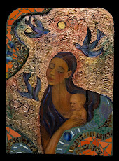
Color is non-verbal. The colors we are drawn towards speak to us about our lives. The soft browns of a favorite coffee drink, the colors of the soil and plants around a favorite place, the warm tones of skin, hair and eye colors we are most familiar with are all things subconsciously feeding our desires for a particular color.

So, how do you know what colors you really want? Look at the colors you desire. When the voice pops in your head that tells you what you "should" want, tell it to go away, and reach for a sample of that paint color that you are sure you "shouldn't" use, but you are fascinated with anyway.

Consider this color sample thoughtfully. You may not end up using the exact color in your decor, but at least you will have acknowledged your desire before you make your final choices.

The more authentic your choices, the less you'll feel the need to rely on fashion color trends that have little to do with your life. And if a color trend does resonate with you, you'll be making a conscious choice rather than buying something because it seems like the thing to do.

The increased consciousness you bring to the purchasing process will have a ripple effect. Each purchase we do or don't make has a result that is felt in both our economic and natural environment. Increased consciousness leads us to consider the effect of our choices on the greater community. And I believe that a change of consciousness is the first step to sustainability.

Note: One company that I admire for their continual openness to environmental/economic sustainability and a more conscious life, something they title Leading the Examined Life is Patagonia.

www.CristinaAcosta.com

Tuesday, April 15, 2008

Planning the Creative Process

Creative projects of all types have two distinctly different parts to the creative process:
  • The creation/planning phase
  • The production phase.
Some creative projects have definite parameters, like building a bridge or constructing a home. Create a plan, follow it, finish it and move on.

In reality there is always a little cross-over between the two phases. Some challenge not considered in the plan has to be creatively solved during the production phase. The bigger the project, the more important that most of the creative work is finished in the planning phase, as resources and time may not be available to make many mistakes during the production phase. A smaller project, like painting a small image or composing a song can be more flexible (less resources of time and materials are at stake).

The trick for me (and other highly intuitive types) when we plan is to not feel hemmed in by the original plan. I know enough now about my creative working process to nurture my strengths.

I became very aware of the importance of planning a large painting when I painted billboards in the late 1980's. Until then, the most I would do before beginning a painting was a cursory sketch, and I'd often skip that step, preferring to work the sketch out in paint. When the painting became 24 feet long and 11' tall, there was much less room in the time and materials budget to make a mistake. For the most part, I eliminated as many errors as possible before I got to the production phase of the painting.

Planning was crucial when I illustrated a children's book, setting up the 17 paintings necessary for the text. I had to paint them all at the same time to ensure the same exact style from beginning to end. Because my style is very fluid, I knew that I would "loosen" as I painted the images. By planning a synchronized completion of the images, I ensured that the final pieces would fit perfectly together.

When I'm putting together a large project, I am most creative when I work with people who have a certain comfort level with what appears to be chaos (but is actually creativity). I recognize the downside to my strengths (sometimes referred to as a weakness) and set up a safety net. I'm not linear or tidy, and my organization style tends to look like a big wind swept through my studio. Hiring an organized, linear, tidy helper to handle the accounting and to keep my routine administrative tasks in order is one of the ways I plan for success. That leaves me free to do what I do best, and when that happens, my projects are much more successful.

All images and writing on this blog copyright protected Cristina Acosta 2008

Monday, March 31, 2008

Tips for Artists to Stay Creative

Here’s a few tips to get you started and then keep you connected to your palette within:

• Watch your thoughts.
Replace any negative or limiting thoughts with something positive or nothing at all. Do whatever it takes for you to develop a quiet and open mind.
• Practice your process.
Every day take five to fifteen minutes and draw or paint something. This can be a new piece every day or a continuation of prior work.
• Remember that technique follows your creativity.
Learning new techniques can trigger a fresh surge of enthusiasm and creativity within you. Use this energy as a way to reach new creative heights. After you learn a new technique (and practiced it) “forget” it. Trust that your subconscious mind will remember the techniques you’ve learned when you need them. This will ensure that you don’t get so caught up in the mechanical aspects of painting that you neglect the creative process.
• Smile when you paint!
You’ll look better, you’ll probably feel better, and you may even paint better!

See more of my work on my website, here are some links:


Silva Life System - Empower Your Mind

Friday, March 28, 2008

The Palette Within - An Article for Artists


Have you ever wondered if or when you’ll be “good enough” to create art that really pleases you? Do you ever find yourself artistically stuck – jumping between different styles or techniques unable to figure out what and how you really want to paint? Do you find yourself wanting to be like every good artist you’ve seen, and then realize that you have no real idea of who you are as an artist?

As artists we can become so caught up in consuming knowledge, accumulating more and more in the way of skills and techniques that we can forget what we are truly about. We are creators. At a time when citizens are regularly referred to as “consumers” and “retail therapy” has become the norm, we stand apart as creators. Before you pick up another brush think about this. Your images may be decorative, transcendent, naïve, poetic, strong, weak, ugly, beautiful, mundane, unforgettable, good, bad or somewhere in between. Regardless of your own and others judgment of your work, remember that out of paint and paper and through the movements of your body you create something material from thought and sensation. Nurturing your process of painting ensures your creativity will continue to evolve and that the art you create will be true to you.

You’re reading this because you intend to improve your painting. Attention to craft is noble, but beware of holding yourself to standards that may have nothing to do with your life and skills. Many times adult art students despair of ever living long enough to get “good enough”. The thing to remember is that every time you pick up your brush your palette is not limited to the colors in front of you and the techniques you’ve mastered. Your palette includes your lifetime of experience.

We’ve all seen amazing drawings and paintings by young children. Beautiful colors and design flow easily from a child unencumbered with limitations. Even if your Goddess with Cats.jpgchildhood ended decades ago, you can still rediscover the open mind that comes naturally to a young child. In my book, Paint Happy I teach you to get in touch with your inner creative self. Think like a child, (albeit a very experienced child) and disconnect your limitations. You’ll naturally reconnect your creativity, resulting in art that emanates from the palette within you – the unique combination of life experiences and art skills only you have.


It’s Never Too Late to Begin

The artist Elizabeth Layton didn’t began painting and drawing until she was 68 years old. From that time until her death in 1993 at age 84, she produced a body of art that continues to be displayed and collected in public and private collections nationwide, including the Metropolitan Museum of Art in New York. Research her work online and you’ll see how she combined the simple technique of contour drawing with a life palette of rich experiences to create powerfully moving art.

This article was originally published in Palette Magazine in 2005.

Read more of my ,Articles and Books


Wednesday, March 26, 2008

Cooling Down or Warming Up a Painting

Color theory is a science. The same concepts I use in interior design or home decor product development have their origin in my training and experience as a fine artist. Here's a demonstration of how when colors shift in temperature (relative warmth and coolness), the emotional or kinesthetic tone of the piece shifts.

In my book, Paint Happy! (2002, 2004 North Light Books), I talk about ratios of warm to cool colors. My theory is that all (Yes, I am getting a bit global here!) design is based on Repetition/Variation of design elements. Designs (any image) have a ratio of one to the other.

Here's an example of how I changed those ratios explained with images of paintings from my Paint Happy series (same as my book!). FYI, Paint Happy! (the book) is officially out of print, but you can get a used copy on Amazon and if you really like it, please write the publisher and ask them to reprint it.

First I created the painting Fish Dinner with mostly warm colors (orange and yellow) in a ratio to cool colors of about 70%/30%. Then, a few years later I wanted to revisit the theme, but with cool tones, so I painted the next picture, Red Fish Blue Fish. The painting isn't a slavish copy of it's warmer sister, mostly because I don't do slavish copies, it's not in my temperament. Nonetheless, it's close enough that you can see how the ratio of warm to color colors is 70%/30% or 30%/70% depending upon how you're looking at it.

See more of my Paint Happy series of art on my site.

All writing and images on this blog are copyright protected by Cristina Acosta

Wednesday, March 19, 2008

Be Creative, Just Don't Make Any Mistakes

Ya gotta be wrong to be right. This maxim doesn't apply to every situation, but it does apply to creative work. If you've ever had a boss who wants you to "try something new, just don't mess up," or if you grew up with authority figures that loved creativity as long as you didn't go "outside the lines," it's time to learn how to fail.

There, I said it, the "f" word. Fail. I love that word. I used to be terrified of it. Like the bogeyman-under-the-bed phase, it took me awhile to outgrow my fear of failure. I used to invent scenarios about what I would do if/when things went wrong, then invent solutions to save myself. What a waste of creative energy. Most things we worry about never happen, and if they do, the details are always different that I ever could have imagined, so none of my safety-scenarios would have helped.

So how did I cure myself? I really didn't. One day, I noticed that I didn't worry much about failure anymore. Looking back I see that there were some things I was doing that got me to my new place. Here are some tips I gleaned from that life experience. Use what works and ignore the rest:
  • Stay in the moment. If that isn't working mentally, hold your breath. There is nothing like waiting to breathe to get you into the moment. I learned this doing water sports.
  • Fail at something you're doing that's teetering in the direction of failure. Let it fall consciously and with intent (also called "letting go") and surprise yourself with what you do next.
  • Think about your failure as one of the launch pads to success. Even Tiger Woods doesn't make every ball he hits. Look for the lesson in the failure and use it to build your next attempt. With every failure, you'll be that much closer to your goal, or know when you've tried enough.
  • Be willing to quit. A thoughtful and considered ending is wiser than sticking with something just so you won't "lose".
Take my art class this summer with Art in the Mountains.

Monday, March 17, 2008

Color Speak at the Paint Store

Have you ever stood in front of a color rack at a paint store, starring at hundreds of color samples and felt confused? It can get even worse if you go in thinking that you might remember something about color from a long-ago art class, then discover that nothing makes sense. Here's how to start making sense of what you are seeing and hearing at the paint store. Starting with the right vocabulary is your first step to success.

The way color is discussed by artists or in an academic setting is different from the way color is understood in a paint store. Here are a few terms to use when describing and understanding color:

Color – Any hue, tint, tone or shade. In other words, any color.
Color Wheel – A round graphic chart showing the relationship between primary, secondary and sometimes tertiary colors. Used to explain basic color mixing, the principles do not apply directly to how paint stores mix color, as most commercial paints rely on bases to modify the colorant.
Colorant – The pure pigment that a paint store adds to a base to create a color.
Base – This is the base product a paint store begins with. It is the “paint” without any colorant added to it. The base color changes depending on the darkness or lightness and the warm or cool tone of the color being mixed. Bases are used only in the paint-store mixing process.
Hue – Specifically refers to a primary, secondary or tertiary color on the color wheel. Though not specifically accurate, many people use the word interchangeably with the word color.
Primary Colors – these are the three colors on the color wheel from which every other color is created: Red, Blue and Yellow. Do not use this term to apply to bright colors in general, as you may confuse the person in the paint store who has a more specific vocabulary. Again, paint stores do not mix a color from the primary colors, they begin with bases.
Complementary Colors – These are pairs of colors that are opposite from each other on the color wheel. Artists mix them together to create beautiful variations that include browns and other “neutral” colors. We’ll use this term when describing the interaction of a variety of colors in the same room. This term doesn’t mean much in a paint-store setting as colors are mixed using a pre-determined combination of a base and colorant.
Tint – This word has two meanings. To artists and color experts, it means any color that has white mixed into it. In a paint store, it refers to adding colorant to a base.
Value – The relative lightness or darkness of a color.
Color Temperature – The relative warmth or coolness of a color.
Saturation – Refers to a color that is more color than white. The darker and/or “more pure” the color is, the more saturated it is.

See paint colors for interiors on the Project Portfolio page of my website.

All writing and images on this blog are copyright protected by Cristina Acosta

See examples of my color consulting portfolio and articles on my website.
www.CristinaAcosta.com Call me to schedule a color consulting appointment in Bend, Oregon or a phone appointment if you don't live in Oregon.

Read more of my Choosing Colors blog entries.

Monday, March 10, 2008

Balancing Flow & Creative Control

The psychologist Mikaly Csikszentmihalyi coined the term flow to describe the mental state when a person is fully focused, energized and involved in what they are doing. Also referred to being "in the zone", this state is a characteristic of the creative process.

When I first read about Csikszentmihalyi's description of flow, I recognized it immediately as the name for the state I often experience when painting or doing sports like skiing or windsurfing.

When I'm fully immersed in painting I'm in the flow state. In the arts, I describe flow as the sense of my body being a conduit through which the art flows unimpeded. I feel as though I have left my conscious mind behind and gone to a state I call super-consciousness, where I've given up critical thought, allowing the work to manifest.

At first, I thought that I would be more creative if I stretched these periods of super - consciousness. While working, I'd notice that I was in flow and use meditation techniques to resist the urge to "surface" from the flow to a controlling thought. I discovered that it didn't really result in better work. For me, balancing flow with creative control results in an experience I can only describe as a sense of flow that takes the shape of a long zig zag. Whether the shape "zigs" up or "zags" down, the axis of the shape always continues forwards.

The time when I stand back and assess my efforts and consciously decide (or control) what to do next is the "zag". The time of unimpeded flow is the "zig". Flow happens, flow doesn't happen. And the cycle repeats.

Sunday, February 24, 2008

Ask Cristina: Children's Book Illustrating

Hi Cristina!

I met you in Richland WA a few autumn's ago. You were teaching the Paint Happy workshop. I thoroughly enjoyed the workshop. I sat in the front with my good friend Te'. We enjoyed the "energy" language you used in regards to your art and painting.
I am a full time artist. I sell my work and show it in local venues and hope to get into some galleries. Last week I was approached by a young man looking for an artist to illustrate a children's book he has written. He has been in contact with a publishing house and the writing has been approved and registered with the library of congress, he just needs an illustrator to make it come to life.
My situation isn't in the books I used for guidance. This is different as I had been approached by an author who has already been in contact with a publishing house who approved it and registered it with the library of congress. The publishing house sent him out to find an illustrator. Which seems odd because most websites say that the publishing house assigns an illustrator to the story and the author has no control over what the illustration will look like. This author has no money to pay me as an illustrator, and needs it in a very short turn around (18 spreads). The payment would come in the form of royalties. He has 6 other children's stories that he has written although none published yet. I think the book has great potential.
I feel it is a big gamble for me (I have never done anything of this sort before). I am more of a fine artist and used to getting 50% payment up front for commissioned work. So this is a very different animal. I have no idea what to expect in the form of royalties.
I noticed on your website that you have illustrated a children's book, and was wondering if you could shed some light on the process... foibles... pitfalls.... Also would something like this help ones career or send it careening into oncoming traffic.
Thanks for your time!! Laura G.

Dear Laura,

Glad to hear from you, thanks for the compliments about the class.

The details of your situation are unusual. Usually a publishing house hires the illustrator and takes care of any contract negotiations which include the issues of the advance (pre-payment) and the royalty structure (often a 50/50 split between the artist and illustrator). Is it possible this man is "self-publishing" his book and hasn't told you that?

Before you put any energy towards this project you need to know more about the financial end of this proposition and more about the project. Illustrating a book won't help your career if it's the wrong project for you. Don't let yourself be rushed by his deadline. The only time a deadline matters in a situation like this is when you have already signed a legal contract that specifies how you are being paid (an advance is wise and to be expected) and exactly which copyrights are being assigned (sold). The contract will also include time lines for performance and more.

If you do get a contract from the publisher (or him, if he's self-publishing), hire a lawyer who specializes in the field of publishing/illustration to advise you with industry standards and customary procedures.

The first thing I would do in your situation is to call SCBWI -- The Society of Children's Book Writers and Illustrators. Pony
up your money to join and take advantage of their stellar resources.

Heres what they say about themselves: . . . We are the the only international organization to offer a variety of services to people who write, illustrate, or share a vital interest in children’s literature. The SCBWI acts as a network for the exchange of knowledge between writers, illustrators, editors, publishers, agents, librarians, educators, booksellers and others involved with literature for young people. There are currently more than 19,000 members worldwide, in over 70 regions, making it the largest children's writing organization in the world.
www.scbwi.org membership@scbwi.org
Society of Children's Book Writers and Illustrators
8271 Beverly Blvd., Los Angeles, CA 90048 , USA
voice: 323-782-1010 fax:323-782-1892 General Questions: scbwi@scbwi.org

I am confident that SCBWI will be able to give you the counsel you need.
Best wishes with this situation. Let me know what happens.

Warm Regards,
Cristina

See more about my books and articles.