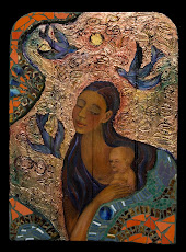
In my book, Paint Happy! (2002, 2004 North Light Books), I talk about ratios of warm to cool colors. My theory is that all (Yes, I am getting a bit global here!) design is based on Repetition/Variation of design elements. Designs (any image) have a ratio of one to the other.
Here's an exam
 ple of how I changed those ratios explained with images of paintings from my Paint Happy series (same as my book!). FYI, Paint Happy! (the book) is officially out of print, but you can get a used copy on Amazon and if you really like it, please write the publisher and ask them to reprint it.
First I created the painting Fish Dinner with mostly warm colors (orange and yellow) in a ratio to cool colors of about 70%/30%. Then, a few years later I wanted to revisit the theme, but with cool tones, so I painted the next picture, Red Fish Blue Fish. The painting isn't a slavish copy of it's warmer sister, mostly because I don't do slavish copies, it's not in my temperament. Nonetheless, it's close enough that you can see how the ratio of warm to color colors is
 70%/30% or 30%/70% depending upon how you're looking at it.
See more of my Paint Happy series of art on my site.
All writing and images on this blog are copyright protected by Cristina Acosta


No comments:
Post a Comment