Tuesday, November 17, 2009

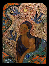
New Retablos of the Guadalupe, Conquistadora and Others for Christmas Shows


Owning a piece of beautiful art may be easier than you think. Meeting the challenging economy head-on, art galleries are working hard to present collectors with affordable art pieces.

To make a series of affordable retablos, I put giclee prints of images from my Hispanic Culture art series of retablos and santos on hardwood panels. Hand rolling and cutting clay into a variety of shapes including leaves, crosses, birds and more I fired those then mosaiced them onto the hardwood. I painted the hardwood with a variety of gorgeous abstract colors then layered that with figurative leaves and flowers created with metallic paint.
The retablos are 15" across x 21" tall and sell for about $598.00.

This holiday season, three galleries are carrying my new series of retablos: These retablos retail for $598.00.

ChimMaya Gallery, 5283 East Beverly Blvd., Los Angeles, CA
www.Chimmaya.com 323-869-8881

High Desert Gallery with locations in Bend, Oregon.
www.HighDesertGallery.com 541- 388-8964 or toll free 866-549-6250.

Suzanne Etienne Art Gallery, Ashland, Oregon. 541-482-1766
www.SuzanneEtienne.com

Contact the galleries to purchase one of these pieces.
www.CristinaAcosta.com

Wednesday, October 28, 2009

Easy Cookies for a Crowd


School events, holidays, potlucks and parties are busy enough without making yourself crazy with complicated baking. This cookie recipe is easy to modify and makes a bunch of small cookies. I usually make three kinds of cookies from one batch. Divide this dough into portions and add different ingredients and you'll have a batch of cookies for any occasion.

Tools: Blender / Vitamix or Food Processor or by hand, Oven, 

Baking Pans: 2 to 4 large cookie sheets - as many as your oven can handle at once

Yield
: about 12 dozen
Baking time: 6 - 8 minutes. Assembly time including overall baking time, about 45 - 60 minutes
Oven 400 F (preheat for at least 5 minutes)
  • 2 Cups Butter softened
  • 1 T. vanilla
  • 4 eggs large - beaten
  • 1 1/2 C. Sugar - Mexican Moreno sugar, organic "white" sugar or light Brown sugar (or a combination)
  • 3 to 3 1/2 Cups flour - unbleached white or add in some whole grain if you prefer, though the texture will change.
  • 2 t. cream of tartar
  • 1/2 sea salt

    Optional ingredients:
  1. 1/2 C. colored sugar - roll teaspoon of dough in sugar before setting on baking sheet.
  2. 1 C. Chocolate drops - add to dough or insert large drops on top of single cookie
  3. 1 C. powdered sugar - when cookies are warm from the oven, put them in a paper bag and gently turn them in the sugar until completely coated. Repeat process again when they are cool if desired.
  4. 1 C. dried fruits and nuts - add to dough
  5. spices - 2 t. cinnamon, 2 t. ginger, 1/2 cloves for spice cookies. Adjust amounts to taste.

    Directions:
    Mix together dry ingredients in a large mixing bowl.

    In a mixing bowl whip butter with sugar until fluffy. Add vanilla and beaten eggs and whip for a few more seconds until everything is mixed. Reduce mixer speed to low and pour the dry mixture in gradually. The dough will stiffen, so you may need to finish mixing by hand. Note that the dough should be just dry enough to roll into little balls. Don't add all of the flour at once. Put in enough to get it to a fluffy, soft texture that is more on the wet side than the dry.
    If you want to make more than one variety of cookie, divide the dough into portions and add the optional ingredients or plan for them depending upon the cookie you want.

    Drop by small spoonfuls on greased baking sheets about 2 inches apart. Bake for 6 - 8 minutes and remove onto a rack to cool.

Subscribe to her Newsletter for once a month news, or get more on her Blog.

vitamix_aff_5200_sm.jpgI Love Using My Vitamix!

Vitamix is more than just a big blender. It's a powerful tool in the kitchen and a powerful tool for a healthy diet. Vitamix recipes and techniques enable you to eat up to 10 fruits and vegetables along with whole grains that are recommended by experts and you'll love the ease and simplicity of the Vitamix.
I use my Vitamix several times a day to make whole food juice, soups from scratch, sauces. smoothies and more. If you're a foodie, you'll love how the Vitamix emulsifies sauces and gravies, grinds grains, purees vegetables & fruits and even mixes a mean margarita or frappuccino!

Start your 30-day no-risk in-home trial today and you'll get FREE Standard Ground Shipping when you click this link!

https://secure.vitamix.com/redirect.aspx?index.aspx?COUPON=06-003174


OR Call Brenda at Vitamix 1-800-848-2649 x 2305 code 06-003174

Monday, October 26, 2009

Color Consulting and Interior Lighting

Color and light are part of any interior design or home remodel project. Here are some of my recent blog entries from my blog ColorConversations.com
______________________________________________________

Nature's Lovers - Green and Purple in Your Home
Landscape artists often refer to the color combination of violet/purple and green as “Nature’s Lovers”. Not only do purple and green look good together on an artist’s canvas, they can look amazing together in your home. From soft gray violet to deep amethyst purples, painting your walls your favorite shade of purple will go with more colors than you might think. Here’s why . . . .READ MORE

Are Color Trends a Self-Fulfilling Prophecy? According to Ford Motor Co., and PPG Industries (Pittsburgh Paint), car buyers in the U.S. still vote with their wallets for the color silver as the most popular car color in the U.S. for the 9th year in a row. Colors trailing behind silver are white, then black. The rest of the automobile color line-up varies by city and region.. . . READ MORE

Painting Your Garage Door Trim
When color consulting with clients who are choosing exterior paint colors I often suggest they don’t call attention to their garage. This advice doesn’t work for every house or every client, but it’s worth considering. Here’s why. . . READ MORE

Interior Lighting and Your Eyesight - Do you need stronger glasses or more light?
Even though you’ve gotten a bit older, it’s not necessarily true that you need stronger glasses (though a doctor has the last word). Sometimes, the lighting in your home is the problem. Though a room may seem well lit to one person, another person may perceive the same room as poorly lit. . . . READ MORE

www.CristinaAcosta.com

Friday, October 23, 2009

Back to My Roots: Mexican-American Style Clay Ornaments

One of the strange things about life is that things from my earliest years of life come back into my life in different ways. This seems to happen more lately. Maybe it's an artistic cycle of some sort.

How it happens is interesting. I get "stuck" in one aspect of my artistic work, so I do something that is very easy for me. Which is why I buy 100 pounds of clay now and then so I can play with making terracotta tiles or tile-like ornaments.

I've been a little stuck lately so out came the clay. I ended up making clay crosses, clay Jewish stars, and clay birds. Just in time for holiday gifts. It's fun. Making decorative clay pieces like this reminds me of some of the Mexican-American or Chicano crafts I would see growing up in Southern California. It's comforting to me as well as somehow seems to open the gates of creative flow within me.

So if you're stuck in some aspect of art (or life) maybe this approach will work for you. Not that you have to make terracotta ornaments. Sometimes I'll make hand-patterned fabrics to wear as sarongs or paint ties for my husband. Whatever it is, it's something I can completely relax with. Opening the kiln is always fun. Kind of like baking bread, but with a more permanent result.

www.CristinaAcosta.com

Wednesday, October 21, 2009

Helvetica - How a Letterform Became Part of All of our Lives

The movie Helvetica is a documentary about a type-face. Before you yawn-off (or click-out), wait a minute. Helvetica is a good movie. Really. At least for anybody interested in any of the arts, design, architecture and fashion fields.

Back in the mists of time when signs were actually hand-painted, I used to paint Helvetica as a letterform (type-form) on advertising billboards. (I was a billboard painter.) Helvetica was always a bit awkward to paint as it's roots were not from the brush and chisel roots of all of western languages letterforms, but from the machine age.

For more of an explanation about the roots of letterforms you must see the movie. Besides setting up the history of typography well, Helvetica the film has interviews with a variety of graphic designers who have completely opposite or divergent opinions about design from each other along with examples of their work so the viewer can make their own judgments.

Listening to contradictory opinions and design theories warms my heart. Strange -- but it does. I love that artists and critics do have strong opinions. And that they change those opinions. Been there, done that, over it is a credo that sits side-by-side with the purity of obsession over one thing for the rest of one's life.

About a week after seeing the movie Helvetica I was working with a designer on a logo I recently did for our family business, www.StandUpPaddleFlatwater.com. She was going through her list of fonts when I saw a name that intrigued me. "Let me see the font Switzerland," I asked her, wondering if what I thought I might see would be something funny.

I did see something funny. Switzerland looked almost exactly liked Helvetica. I don't know the history behind the Switzerland font, but I get the joke. Helvetica is a German made (and owned) type font that was originally supposed to be named after Switzerland. They changed the spelling slightly for the times. It was a marketing ploy of some type (see the movie). In response, somebody made a competing type form they titled Switzerland. A subtle joke tucked into a list of fonts. That's the kind of meaning in an everyday object that keeps the art world inspiring.

www.CristinaAcosta.com

Friday, October 16, 2009

I'm Teaching an Art Workshop October 24th and 25th in Bend, Oregon

A6 - Atelier 6000 in Bend, Oregon near the Old Mill District is a wonderful printmaking studio with a bright and light energy. It's a wonderful place to practice your art form.
Here's the class info:

When: October 23rd (evening artist talk); October 24th and 25th
Where: 389 SW Scalehouse Ct., Suite 120, Bend, OR 97702
Call: 541.728.8527 for cost and additional details.
Cost: $115.00

Class Info:
Bring flowing creativity into your artwork. Cristina is teaching a art workshop at Atelelier 6000 focusing on using painting and optionally mono-printing to work with the concepts. Invite freedom and flow into your art and jump-start your creativity in this exciting class that breaks down the barriers between the artistic practices of painting and printmaking. Veteran artists Pat Clark and Cristina Acosta will demonstrate their process and techniques for you. You’ll learn to combine painting and printmaking techniques to create something new and different. Not only will you be inspired, informed and empowered, you’ll have accumulated class techniques and processes to inform a portfolio of unique drawing and painting outcomes.

Cristina Acosta is teaching a residency Oct 24 & 25 from 10 a..m. - 3:30 pm entitled Printmaking as a Vehicle to Painting. Registration is underway. Cost of the workshop is $115. For a description of the workshop check out the website at www.atelier6000.com


www.CristinaAcosta.com


Thursday, October 15, 2009

University of Oregon Board of Visitors for the School of Architecture and Allied Arts

Attending the University of Oregon and graduating with a BFA degree in Painting was a wonderful time of my life. I put myself through school working as a window and sign painter along with some generous scholarships that enabled me to finish a studio degree in painting. Frank Okada, Ron Graf, Morales and others were professors that made a deep and lasting impact on me and the art I've gone on to create.

I'm proud and honored to have been invited to serve on the Board of Visitors for the University of Oregon's School of Architecture and Allied Arts. I encourage readers with the funds to donate to consider this college as a worthy cause. Here's some of the info about the BOV from the U O:

____________________________________________________________

University of Oregon Board of Visitors

What is the Board of Visitors?

The Board of Visitors was established in 1987 as an advisory group of distinguished University of Oregon alumni and friends representing the departments and programs of the School of Architecture and Allied Arts. Our goal is to support the school in developing the highest quality of its educational programs by establishing strong connections between the school and the professional community.

Who are the Board of Visitors?

Members of the board are accomplished professionals with a shared commitment to make themselves available as professional resources for students and faculty; to increase professional and alumni outreach and communications; and to assist the school in attracting investment in research, instruction, and service.

A&AA Board of Visitors

(I'm the woman second from the top on the right side in the tiger stripe sweater)

www.CristinaAcosta.com

Tuesday, October 13, 2009

Thinking About Color Changes

The changing colors of the season inspire me to write about color. Here is a list of my most recent articles about color from my blog ColorConversations.com:

Blanca, The Color White - I was looking at the color white last week and realized that for me, white had became a symbol of global interconnection. How did a color I see every day suddenly have a new meaning? Here’s what happened. . . . .

Color and Design Concepts - Repetition and Variation (and a Snake) - Good design snakes our attention. Here’s why. Looking at too much of the same thing can turn a good thing into a nothing. That is, nothing you’d notice or want to look at. Too much of the same thing sends our brain to sleep. Maybe not literally, but our attention drifts and we’re on to the next thing. Our human brains are on the alert for differences. That alertness informs us when. . . .

Color Meanings, Color Symbology and Color Psychology
- You may not know this, but you were covered in color symbolism, meanings and psychology from the day you saw your first pink or blue baby blanket. Scientists, religions, governments, mystics and artists have always assigned meaning to colors over the centuries of human kind and there’s no way to get away from those meanings. . . . .

www.CristinaAcosta.com

Friday, September 11, 2009

Gracias to Latina Magazine for the Article!

Angie Romero, a writer for Latina magazine wrote this piece, Madonna Mia about my art exhibit, Reshaping the Divine. Thanks Angie for supporting my work. Here's an excerpt from Latina:

_________________________________________________

My older sister was named Maria Auxiliadora, after the Virgin Mary. Maria is a very predictable name for a Latina, but my mom named her that because she was in a near-fatal car accident when she was pregnant with her firstborn, so she promised la virgen that if she and her baby survived, she’d be forever grateful. To this day, she is a devout Catholic. Me, I’m more spiritual, but that’s another story for another day.

I recently received an email from an artist who did a whole collection of Madonnas (as in the mother of Christ, not the queen of pop). Cristina Acosta was born in L.A. to an Anglo American mom and Mexican American dad. Her paternal roots date back to New Mexico in the late 1500s. Growing up, she says she was always fascinated by that side of her family tree.

Her Madonnas (my favorite of which is “La Sirena Verde,” which Acosta painted for her sister to celebrate her recovery from cancer) are painted with oil, sterling silver, copper, gold metal leaf, and inlays of antique, gold-glazed ceramic tiles. They often delve past the dawn of Christianity and also represent the earth religions of the Native Americans. . . . READ MORE at Latina
____________________________________________________________
www.CristinaAcosta.com

Wednesday, September 9, 2009

Scam Artists on the Internet Target Real Artists

Con artists spend their creativity and intelligence tricking people so that they can steal their money. Even if you get away from a scam artist with your bank balance intact, you've still had your time stolen. Either way, it's a loss of potentially positive energy on both sides of the relationship.

Yesterday, a woman called me to get my bank information. She claimed to be a kindergarten administrator from Australia who wanted an illustration of mine for a cookbook she was putting together for a worthy cause. She had sent me an email introducing herself and her project and we'd entered a amicable email conversation of about 3 or 4 letters. The money she offered me was fair for her type of project. She called and had a lovely Australian accent and acted very friendly when she asked me for my bank account number and routing information. I told her I'd send her the information the next morning.

I did my due diligence and checked out the school she mentioned. There was no school by that name at that address. If there had been, I would have contacted them directly to confirm her position and project. That, along with a few other complications to the transaction were big red flags. She didn't get the financial information she requested from me. I'd wasted time I could have spent more positively.

Having an internet site for over a decade, I've been the target of quite a few of these scammers. It's always a sad waste of time. I've been written to and called by so many of these people over the years that I am very careful about doing business with anyone who insists on discussing money with me without being transparent as to who they are.

Scammers often target visual artists, probably because we have the reputation of being a bit naive to business practices and we usually have items to sell that cost hundreds or thousands of dollars. Considering how many astute people were taken advantage of by Bernard Madoff, I can't guarantee that my advice is fail-safe, but it's a start. Here are some red flags I want to share with you so that you can recognize these thieves:
  • HASTE: They are in a hurry. Some sort of time urgency is making it necessary for them to hurry the process and they need your help.
  • MOBILITY: They are often moving around between foreign countries or cities which causes some sort of extenuating circumstance.
  • PAYMENT: They have excuses about how they need to pay you. Maybe their Visa doesn't work, or they claim to live in a town without a proper bank or Western Union office. (This often segues with the mobility theme.)
  • KICKBACKS: They want you to send them back the "extra" money that they insert into the transaction to "cover fees".
  • OPACITY: They aren't upfront with who they are, their phone number, where they live, what their project is, etc. Double checking their phone numbers often leads to dead-ends. If they claim to be somebody, check out their claim thoroughly and be sure to call the person.
  • COST OF YOUR ART OR ART SERVICE: They insist on "talking" to you through email and want your pricing information without giving any information of their own. They often offer to pay more than your price.
So what do you do if you have a legitimate international art customer or art collector interested in your art work? You can't always tell if an art customer is honest. The best you can do is put in place some financial safeguards.
  • BANKING: Work with your bank to set up an account that you use ONLY for these type of transactions. Explain your business to the bank officer and they will help you put safeguards into place that minimize the risk you undertake when handing out your bank account and routing information. One of the dangers my banker explained is that with the account number the thieves will create bogus checks to withdraw money from the account.
  • VISA AND OTHER CREDIT CARDS: Call the company to additionally verify the legitimacy of the card number and info you receive.
  • WESTERN UNION: Don't give ANYBODY a kickback for fees. If they want to use Western Union to transfer money to you, they will absorb the fee. Western Union will wire the money to the Western Union office you designate. You DO NOT NEED TO GIVE ANYBODY YOUR BANK INFO TO GET A WESTERN UNION PAYMENT!! Be sure to check out the Western Union website and to call for more information.
  • SHIPPING YOUR ART: Regardless of the delivery system you use - whether you are shipping original art or sending electronic files, do not send anything until the money has cleared the bank. Again, talk to your banker and rely on their advice.
www.CristinaAcosta.com

Friday, August 14, 2009

Why Should You Paint Your Ceiling White?


During a color consulting appointment clients will often remark that they are nervous choosing a paint color for their ceiling. There are far more reasons to not paint a ceiling white than you'd think. In situations where white is the perfect color to use, it is successful only because it is used very consciously as a color -- not a knee-jerk reaction to getting out of the paint store sooner than later. I posted a piece about the color white on my color blog. Here's the lead.
____________________________________________________________
Painting your ceiling white is not necessary or even always a good idea. White paint will not always make your room look larger, cleaner and more fashionable. Sometimes white will seem to expand the size of a room, but sometimes it’s a big mistake. Mostly, people paint their ceilings white because they don’t know what else to do.

I’m not exactly sure when white ceilings became fashionable, though I suspect the country’s fascination with white paint began in 1893 at the Chicago World’s Fair. The famed White City at the World’s Fair included a complex of buildings and streets over an area of hundreds of acres. Buildings were finished with white stucco and brightly lit with the new-fangled street lights. Acres of radiant whiteness must have been an entrancing alternative to the dark countryside and dimly lit city streets filled with dark tenement buildings.

Then, about thirty-five years later, the Great Depression. . . READ MORE at Color Conversations with Cristina.

Monday, August 10, 2009

Color Consulting Architectural Project Portfolio


Creating color plans for residential, commercial and institutional buildings is a fascinating way to put color theory into practice. Color is a language that exists in the spoken and written word as symbol and metaphor. I love the challenge of translating the subconscious and conscious reactions of my clients to color into a color plan that they love.

Read more about my color advice at Color Conversations with Cristina
Hire me as your color expert:
Cristina Acosta Art & Design llc, Certified Minority Contractor

www.CristinaAcosta.com

Friday, August 7, 2009

Change a Few Colors Instead of Repainting Your Entire House

I posted a new entry on Color Conversations with Cristina. I wrote about how to fix an exterior house paint project that didn't turn out quite like you'd expected. Here's the lead:

Are you ready for a home makeover but you don’t want to break the bank? Have you ever painted your house and when it was done, wondered why the paint job didn’t look as good as you thought it would? Changing paint colors doesn’t have to be a complete re-do. With a few strategic changes of color you can get the look and pizzaz you want by changing only the colors or areas that make the most difference, rather than repaint the entire exterior of your home. . . . .READ MORE

www.CristinaAcosta.com

Wednesday, August 5, 2009

Bragging About My Kid's Artwork

Isabella Acosta Barna's paintings

Please forgive me, but I'm a mom and I am so proud of my daughter, Isabella Acosta Barna, that I just have to brag a bit. Isabella's greeting cards are for sale at the Clinton Presidential Library Gift Shop!!

And, a portion of every sale funds The Alliance for a Healthier Generation.

The Alliance for a Healthier Generation Youth Advisory Board and Empower Me 2 Be (of which Isabella is a board member) is on task to halt the increase in childhood obesity. Last year the Alliance asked Isabella to make some images using their color scheme that convey health. They would then choose one or more to use in their outreach.

The slide show of Isabella's art work has a photo of her at work in her respirator, carefully layering stencils and other collage materials on her piece as she paints. This was a great opportunity for her to work within the client's design and concept parameters as she explored how to creatively fulfill those guidelines.

Isabella is a strong and independent artist -- which means that I had nothing to do with the outcome of these images beyond explaining to her the mental/artistic process of how to approach this type of project. I love her final images -- they are beautiful!

And as a mom and an artist, I'm glad my child likes to make art. Presenting art to a kid and knowing when to slip in a little teaching now and then is a very fluid experience over their lifetime. There is no one right way to encourage creativity. My approach is to have the tools and time available and then to be a good example of working my own creative process.

www.CristinaAcosta.com

Friday, July 31, 2009

Successful Artists and Their Original Art


Years after I've taught an art class, a student will introduce themselves and tell me that they liked my class. One of the best things about teaching is having a student tell me that their art learning experience with me was positive. Especially if they are telling me months or years later when their memory has sifted and re-sifted the experience until the essence is left.

My next best thing is bragging about my art students. Some of my students come to me as experienced artists who glean a little and move on. Others are beginning artists -- a group I feel especially responsible to. Teaching someone art for the first time usually sets the tone for their attitude towards art education.

Here is some artwork from past contacts:

Steve Bennett took Central Oregon Community college art classes from me in the 1990's. He was already an accomplished artist and has gone on to create even more beautiful work. His lovely pastel of this forest glade is the cover for an artist workshop exhibit and sale at the U.S. Hotel Ballroom, California & Third St., Jacksonville, Oregon. August 25 - September 2, 2009 Daily 10 am – 7 pm. Gala Reception, Saturday, August 29, 2 – 4 pm . Steve Bennett and his wife, Sue Bennett are both accomplished artists and educators. They operate the art tour business, AIM Art in Motion Workshops.

Dianne Charewicz, a blog reader sent me this recent note regarding her inspiration from my book, Paint Happy : (Here's a photo of her art)

Hi Cristina,
Back in February I had emailed you asking how you sealed the soft pastel on top of the acrylic painting. I promised to send you a picture of my painting. Well, here it is. My husband really liked it and so many people comment about how "Happy" it is! Thanks for your help!
Blessings,
Diane Charewicz


www.CristinaAcosta.com

Wednesday, July 29, 2009

Looking for Art in Little Rock, Arkansas

I was in Little Rock, Arkansas recently, looking for art. My daughter, Isabella Acosta Barna is on the youth Advisory Board (YAB) for the Alliance for a Healthier Generation and their Empower Me kid's movement to stop childhood obesity. Her board meetings were held in the William J. Clinton Presidential Library. The Clinton Library is a beautiful modern building with a Platinum LEED environmental rating.

While in Little Rock, I got about a few hours to myself during the afternoons to explore. I visited a few local museums and saw some very nice work. The Historic Arkansas Museum had some art as part of their exhibit: John Ellis and Don Shaw (a sculptor and painter) with the exhibit, Cosmic Interplay - Light and Darkness (ends Aug. 16, 2009); and Custom by Design - Contemporary Furniture Handmade in Arkansas (ends Jan. 10, 2010). The exhibits had their moments, but I wasn't captured by anything. (That "wow - I wish I'd made this" or "this is amazing" feeling).

I walked further south to the Arkansas Arts Center, a complex including a museum, children's theater and studio school. One of the exhibits there was of the French artist Paul Signac. A wealthy early 20th century industrialist invested in Signac's career and built a museum with a permanent collection of decades of Signac's work as the centerpiece. Seeing the artist's life's work through the decades I was struck by how the patronage of one man made this gift to the future (me, and others seeing this work) as well as supporting the artist during his lifetime.

My favorite contemporary work (also in Arkansas Arts Center,) was the contemporary artist Jun Kaneko's large ceramic pieces. Works in a series he called Dango -- a Japanese word for rounded form (he appears to be of Japanese ancestry). Kaneko's exhibit included drawings and smaller pieces also which didn't do much for me. I found his large pieces compelling.

Ben Whitehouse had his exhibit of paintings and photos titled, Ben Whitehouse: Observation. My favorite piece from his was the calendar of paintings of the same ocean scene for every day of March.

When visiting Little Rock, be sure to take the River Rail Electric Streetcar. It's only a dollar or two and it's a fun ride around Little Rock in a vintage (but air-conditioned) electric streetcar. The very charming driver was also a wonderful tour guide, pointing out landmarks along the route. The River Rail Electric Streetcar tour of Little Rock is the best bargain.

For a complete listing of Greater Little Rock Museums and Cultural Attractions see www.LittleRock.com. And be sure to eat at least one meal at The Flying Fish. It's a order-at-the-counter, seat-yourself diner with delicious local fare.

Try some Southern style microbrew at Boscos. They offer light and medium bodied microbrews that you can sip on their deck overlooking the riverfront when the weather is good. They're just down the street a short walk from the Flying Fish.

Thursday, July 23, 2009

Can Color Change Your Mood?

Do you feel like no matter what goes on around you, even if you're not in control you at least know what's going on? Well, you do and you don't. The senses we rely on to understand the world around us aren't always accurate. Shapes and colors manipulate how you perceive the world around you -- along with texture, temperature, scent, sound and more.

Think about bright colors and food. Vitamin rich fruits and vegetables are mostly colorful. Fast food restaurants don't serve colorful fruits and vegetables, so instead they put strong colors in the decor of the restaurant, the pictures on the menu and the packaging. Candy
 is almost always manipulated to be artificially brightly colored to appeal to the human impulse to eat brightly colored healthy food.

As obvious as the manipulation of food colors are, colors in our homes and business offices manipulate where our attention goes as we move through the space and how we feel about the space. A red door on a brown house focuses our attention on the door.

But don't feel that colors have one note, like the keys on a piano. Though many studies of colors have outcomes that insist yellow is happy or red is stimulating, those studies can only address that color in one environment. Colors interact with each other to create a melody line, just a
s the keys of the piano can combine to create a tune.

The bottom line is yes, color affects your mood. But don't get caught up in creating a rigid identity for every hue. The interaction of a color with other colors and the cultural viewpoint(s) of the people experiencing the colors is the ultimate arbitrator. Assigning one emotional response to a color is like insisting that each note of the musical scale has an immutable meaning. Like insisting that the note of middle C is always happy and F minor is always sad.

Pay attention to the interaction of colors and strive to be aware of the meanings you've assigned to colors and you will begin to use colors more creatively in all aspects of your life.


Photos: I took these photos in Oaxaca, Mexico. The gorgeous colors of flowers mixed into the salad greens and vegetables (it tasted as delicious as it looks) are mimicked in the colors of the candies and other sweets this woman was selling at her snack stand.


See my color consulting work for residences and public buildings on my website at www.CristinaAcosta.com

See examples of my color consulting portfolio and articles on my website.
www.CristinaAcosta.com Call me to schedule a color consulting appointment in Bend, Oregon or a phone appointment if you don't live in Oregon.

Wednesday, July 22, 2009

Art of the Tatoo - Portland Art Museum


Altering your looks is the status quo of our culture. Makeovers are featured in most every magazine and for the financially backed, an entire menu of plastic surgery lite and full course options abound. Change and reinvention are firmly embodied in the flesh around us.

After seeing Marking Portland: The Art of the Tattoo at the Portland Art Museum June 20 - Sept. 7, 2009, the choices offered by the question of change and reinvention expanded. Tattoos are the tool of choice for many Portlanders seeking to express themselves beyond a nip, tuck or new hairstyle.

My daughter, Isabella and I spent the afternoon in the Portland Art Museum, ending our stay with a rest on the benches downstairs and the slide show that was the exhibit, Marking Portland: The Art of the Tattoo.

Sitting on the bench was the Checkerboard Face Man. I introduced myself to him and he was very gracious regarding my interest in his tatoos. His name is Matt Gone and he's an artist who has used his body as his canvas, covering everything except his gums and palms of his feet with tattoos. Willamette Week featured a great piece describing his motivation and life experiences as a completely tattoed man.

Matt posed for me, pulling up his pant legs and shirt to expose his body covered in a checkerboard pattern of tatoos interspersed with colorful motifs. He's an affable man with quiet and unassuming body language that is at odds with his flamboyant markings.

I admire Matt's dedication to his personal vision. In the Willamette Week article Matt says that his wish is to preserve his skin for display after he dies. For Matt, reinvention never stops.

www.CristinaAcosta.com

Tuesday, July 21, 2009

Thanks to Chicano y Que

Thanks to ?Chicano y Que? blog for posting info about my art exhibit, Reshaping the Divine: Contemporary Hispanic Retablos Exploring the Divine Feminine, at El Museo Cultural in Santa Fe, New Mexico for Summer 2009.

(Can anybody give me a tip to make a Spanish question mark and accent marks in Blogger?).

Chicano Y Que? is a blog Jesus Garza writes that is devoted to information related to Chicano/Chicana culture. Jesus is also a wonderful art and commercial photographer. You can see his beautiful photography, some of which includes photos of Cesar Chavez on his website, Jesus Manuel Mena Garza Photography.
www.CristinaAcosta.com

Monday, July 20, 2009

Painted Sarongs for Sailing


Color and light filled with air propelling me across the surface of a High Cascade's lake. WOW!

Flatwater stand up paddling on lakes usually involves wind of some sort if you're out past noon. My friend, Judy Shasek and I were playing around on Hosmer Lake, Oregon last week and came up with a lot of things to laugh about while we experimented with our SUP boards.

Memories of catching the wind on windsurfers inspired Judy and I to take advantage of a tail wind and try some sailing. Since I often travel with sarongs (as SPF, clothing, mosquito distractor, etc.) I was ready.

I whipped my sarong into the air with a gust and Judy and I made a jib sail between us. It worked so well that we returned the next day with two sarongs and caught downwind puffs singly wherever we could. We even convinced Judy's husband, Ed to give it a try.

I painted these sarongs on silk and cotton and was totally grooving on how they looked filled with air and lit through with sunlight. Silk was definitely the material that won the day as a sarong sail. Silk is strong, lightweight and catches the wind easily. It also looks good on.

Judy and I got so caught up in sarong sailing that we almost re-invented the windsurfer!

Judy's husband, Ed Shasek took the photos (unless he was in them).
www.StandUpPaddleFlatwater.com

www.CristinaAcosta.com

Saturday, July 18, 2009

The Barbra Streisand Rose

Portland, Oregon is an interesting city to visit. I'm often in Portland taking my daughter to her fencing training, so I'll take a few hours while she's training to be a tourist and check out the local scene.

The Portland Rose Garden is a beautiful garden on the side of a small mountain that overlooks the city of Portland and the river. I was there a few weeks ago around the Rose Festival dates and made sure to visit the rose garden. The scents and colors of hundreds of blooming rose bushes is worth a visit.

I asked a gardener to send me to the roses with his favorite scents and he sent me to the bottom of the garden looking for the Barbra Streisand Rose. Wandering the garden I came across this very handsome poodle and his two female owners. I asked them why he was dressed in a Hawaiian lei and decorated. They told me that he had just recently won First Place in the dog contest in the Gay Pride Parade downtown.

"Is he gay?" I asked, pointing to the dog.

"Of course, he is," they replied, "that's why he was in the parade."

I pointed out the Barbra Streisand rose, a deep pink rose with an extravagant scent and asked them if I could take the dog's photo in front of the rosebush.

"This is wonderful," one of the women said as she helped to pose her dog, "we just got him a Streisand CD yesterday."

www.CristinaAcosta.com

Thursday, July 16, 2009

Art and Grieving - Making Group Art


The past several months I and my family have lost some close friends in accidents. In my own way I work through these sad times in my art work. Sometimes consciously working with the experience, but mostly by continuing to work and observing after I'm done that references to that sadness are in the work.

My friend, Cameron Clark, owner of C3 Events recently experienced the passing of Jimmy Pantenburg, the child of a close friend. Cameron called me and asked me if I'd be willing to work for him creating a place both physically and psychically for Jimmy's friends to make a mural in his honor.

I just finished the mural project and want to share with you Cameron's brilliant idea. Brilliantly rich was how I felt watching a dozen teenagers with spray cans talking and painting as they created a tribute to their late friend. (Though, as an adult, the irony of teaching teenagers the fine points of spray painting did give me a smile.) Not only did they all agree that the piece is "really sweet", they had a chance to talk about the fun things they did with their friend. They'd look through Jimmy's album of spray paint stencils and photos of his work, then they'd copy something as they talked.

I didn't know Jimmy, but after seeing his work and listening to his friends, I feel enriched by his life. His friends got a chance to live consciously with their feelings of grief and share them openly without any heavy expectations or the sense that they had to do or be any particular way. They were hanging with his spirit. It was a beautiful thing.

On a practical note -- facilitating the creation of a group art piece that's 5 feet tall and 15' long necessitated some basic design parameters. Here's what I did:
  • Painted one basic background color. In this instance, red.
  • Put together a selection of spray paint can colors that would work with Jimmy's themes.
  • Determined the central theme and set that first so that the kids could work around it. In this instance the focal point was the grafitti moniker, "Always".
  • Gave the kids tips on how to best use their spray paint cans.
  • Kept the image "floating". That's a term I use to describe my method of keeping the entire surface of the image working together at the same time. Practically, that meant I'd work intermittently with the kids -- being sure to disappear enough that they felt very invested in the work.
  • When the kids were done I spent some time "tightening" the image so that it would be even stronger.
I enjoyed helping out this way. I highly recommend a mural project of this sort as a way to bring a group together, regardless of the occasion.

www.CristinaAcosta.com

Tuesday, July 14, 2009

Muchas Gracias La Bloga for Your Review of Reshaping the Divine

Muchas Gracias to La Bloga for the generous and positive review of my art exhibit, Reshaping the Divine - Contemporary Hispanic Retablos Exploring the Divine Feminine currently at El Museo Cultural, Santa Fe, New Mexico. You can read the full piece and a lot of other very interesting things on La Bloga.


Here's an excerpt of the review:
__________________________________________________________________
"This is quintessentially female, strong, sinous, visual art. It is a contemporary re-visioning of traditional retablo, hinting at the aesthetic of popular commercial artists like Laurel Burch, but containing a depth of spirit. There is a certain richness, an evanescence emanating from the figures portrayed.

Acosta has an ability to make a heart connection with the observer beyond the demands and trends of the marketplace, or the prevailing winds of "fine" art communities and critics. I find Acosta's work to be completely accessible, capitalizing and re-visioning icons from a metizo heritage, as well as feminist ideas of the female God-force.


She's also creative in the use of precious and mundane material in the creation of these retablos. In an in depth look at her site, piece after piece reveals she is truly a renaissance woman balancing commerciality with content and succeeding admirably." READ MORE. . . .

www.CristinaAcosta.com
See the images of my retablos, santos and ex-votos.

Monday, July 13, 2009

Latin American Herald Tribune Features My Exhibit - Reshaping the Divine

Thank you to the Latin American Herald Tribune, for the interview and feature of my art exhibit, Reshaping the Divine - Contemporary Hispanic Retablos Exploring the Divine Feminine, on exhibit at the El Museo Cultural in Santa Fe, New Mexico for the Summer 2009.

I am very appreciative that my work is getting such positive attention. I've included an excerpt. You can READ MORE here.

EFE News Services (US) Inc. www.efe.com
Spain's International News Agency- Agencia EFE is the leading newswire service in Latin America and Spain. Everyday, directly or indirectly, millions of individuals are brought up to date on what is happening in the world by EFE. Of its total 3.600 media subscribers, 531 are
located in South America, 110 in Mexico, 62 in the Caribbean, 78 in Central America, 150 in the USA and others in Spain, Europe, Africa, The Middle East and Asia.

____________________________________________________________
Chicana Artist Explores Heritage Through Retablo Paintings

By Lydia Gil

SANTA FE, New Mexico – Chicana artist Cristina Acosta has turned to sacred art as a means of exploring her religious and cultural heritage, incorporating aspects of her life, beliefs and family history into Madonna retablos.

“The tradition of the retablo (devotional image) reflects both the past and the present,” said the artist, whose works are now on display as part of an exhibit of contemporary retablos at this southwestern U.S. city’s El Museo Cultural.

The word “retablo” in Spanish dates back to the Renaissance and Baroque era and was used to refer to large screens that were placed behind altars in churches and were decorated with paintings, carvings, and sculptures.

These large altar screens then became prevalent in colonial Latin America as well, and by the 19th century oil-on-tin retablo paintings of Christ, the Virgin, and saints were commonly produced by amateur artists for devotional use in the home.

However, in parts of the southwestern United States, such as New Mexico and Colorado, retablos passed beyond the realm of sacred art into that of folklore.

Acosta said there are two types of retablos, one belonging to the tradition of Catholic saints and the other to that of “ex-votos,” or offerings of gratitude.

She says the first group is similar to the concept of icon painting in Byzantine art, in which the figures of saints or the Holy Family are painted in accordance with strict liturgical rules that define how the main figure should be portrayed.

“The counterpoint to that tradition is the ex-voto retablo, for which there are no rules but rather (the artist) creates a personal vision to give thanks for a blessing (received) or when a petition was heard,” she said.

It is within this folk tradition that her art is rooted.

Acosta said her retablos have served as a medium for meditating on her family heritage, her Latino identity and her role as a woman and an artist.

“My retablos are strictly related to my life, my Latina-Chicana cultural heritage in the southwestern U.S. and my personal opinions and life experiences,” she said.

Acosta, who now lives in Oregon, grew up in a Catholic family – the daughter of an Anglo-American mother and a Mexican-American father – in southern California. . . . READ MORE

Here are some links:
http://mx.news.yahoo.com/s/10072009/38/n-entertain-retablos-marianos-dominan-arte-chicana.html
or
http://www.impre.com/eldiariony/espectaculos/2009/7/11/retablos-dominan-el-arte-de-cr-134844-1.html

The article was picked up by the international service, so you may find it in Latin America and Spain as well.

Here it is in English translation:
http://www.laht.com/article.asp?ArticleId=338991&CategoryId=13003
__________________________________________________________________
www.CristinaAcosta.com

Saturday, June 27, 2009

In Memoriam - Goodbye Eddy Miller

My dear friend and friend of my family, Eddy Miller passed on this week. I'll blog later when I'm ready. You can read about Eddy here.

Wednesday, June 17, 2009

I'm Writing a New Blog - Color Conversations!

So many people come to this Create and Relate blog looking for color answers that I've decided to devote a blog just to the subject of choosing colors. Titled, Color Conversations, it's a blog devoted to the process of choosing colors. I love helping clients choose colors for their homes or business projects and have been actively color consulting for over 5 years. 

Color consulting is a business that I enjoy and that I find enriches my perceptions as an artist. I love the process of guiding clients to discover their best colors whether it's a home or business. Stop by my new blog to say hi. I'd love to hear your color stories.


Tuesday, June 16, 2009

Learning Printmaking

I've spent as much time as I could the last two weeks at Pat Clark's printmaking studio, Atelier 6000 (A6), in Bend, Oregon. Pat, her helpers and fellow printmaking artists have been especially helpful guiding me through the world of printing. Here's what I've learned so far.

Printmaking is FUN! It's also exacting, engaging and messy. I've been learning mono-printing as everyone tells me that monoprinting is most like painting, therefore an easier segue into printing for a painter.

I especially love how I can't predict anything (yet) during the printing process and that results in surprises that always lead to something even better. It's a fun and relaxing way to fill my creative well. I'll post of few of my learning prints when I have some I really like.

www.CristinaAcosta.com

Friday, June 5, 2009

Nature Influences My Art

The well of experience that I draw from to create includes everything I experience. To keep the waters of creativity flowing, it's very important that I continue to experience new things and experiment with different viewpoints.

Changing my viewpoint is a lot easier when I try something new that always pushes me to learn. One of the easiest methods to bring fun and positive change into my life is athletics. Stand up paddle boarding has become one of my favorite sports. This is my third summer of paddle boarding and I'm hooked. I've learned to surf ocean waves, wind-driven lake waves, and paddled rivers. Besides being fun, stand up paddleboarding puts me in to intimate contact with nature. I'm often on waterways that have their own life rhythms and images.

Last weekend I went on a 35 mile downriver paddle with some of our local stand up paddling group. (You can read more about paddle boarding on the SUP Stand up Paddle blog my husband I and share.) The nine hours we were on the Deschutes River in Oregon, filled my senses with both obvious imagery and more subtle experiences.

I work animal and plant images into all of my paintings regardless of the style I'm working in. Here are a few examples of oil paintings I've done that focus on animals. The Blue Heron is a large 4' x 6' oil of an experience I had watching a Blue Heron fly through the forest before dawn. The Eagle is a raptor that I see often on the High Desert Plateau near my home. The Deer Herd is often in my garden (eating or drinking!). Flora, fauna, madonnas and figures populate my imagery and flow from my actual experiences. Figure drawing once a week keeps me in touch with on of my favorite artistic disciplines, stand up paddle boarding is another type of discipline. It's all good!

www.CristinaAcosta.com

Wednesday, June 3, 2009

Reshaping the Divine - Contemporary Hispanic Retablos Exploring the Sacred Feminine


This exhibit is up for Summer 2009. The artist statement describes the personal context of my art and about the intent behind these pieces.
_______________________________________________________________
Reshaping the Divine: Contemporary Hispanic Retablos Exploring the Sacred Feminine

Cristina Ortiz Acosta – Artist Statement 2009 - Exhibit at El Museo Cultural, Santa Fe, New Mexico. Click here to see this series of Hispanic Retablos.

Over the past twenty years, my series of Madonna retablos came to me in ebbs and flows via a series of powerful dreams. The dreams started during my pregnancy with my daughter. For the entire pregnancy I dreamt of being a woman on a journey north across dusty plains and through arroyos as I mostly walked behind an oxcart. The dreams ended in a room lit by a wooden candelabra filled with tallow candles and the birth of my daughter, Isabella Pilar in 1993.

I called these dreams my Maria Dreams because in the dreams, I/she was named Maria. Seeking the meaning of those dreams over the years brought me down a path I could never have imagined and deepened my understanding of my cultural heritage. Searching for the meaning of my Maria Dreams eventually lead me back to New Mexico, the land of my Ortiz ancestors.

My paternal grandmother, Catalina Maria Ortiz Acosta, born in 1904, was the daughter of J. Nestor Ortiz and Maria Elena Salazar, descendents of the original Spanish settlers founding the cities and villages throughout New Mexico. Researching my family genealogy (my grandmother spoke vaguely about her ancestors), I discovered that my direct ancestors had participated in the initial 16th and 17th century migrations of the Spanish, traveling North from Mexico City into the region that is now the State of New Mexico. I read books about the era and became fascinated by the types of experiences my female ancestors must have had while living on the New Mexican frontier for generations. With this research nurturing my experience of my personal history, my calling to paint Madonna’s began to take shape.

Born in Los Angeles to an Anglo mother and Hispanic father, early on I was aware of cultural concepts because of the differences between the two sides of my family. Despite their differences, Catholicism was the central theme for my parents. Celebrating their devotion resulted in religious images from the Americas and Europe scattered throughout our home and those of our relatives. Images of Mary the Mother of God as the Guadalupe, Conquistadora and many other versions were always present. Along with those images were displayed American Indian items from the Ortiz ranch.

The artifacts from the Ortiz family ranch consumed my imagination from as far back as I can remember. Handmade Indian blankets and pots, and even a gold menorah (referred to as a “candelabra” by my grandmother) made by Ortiz ancestors generations past (some of the men were renowned filigree gold smiths). Those as well as the chili ristras hanging in my grandmother’s kitchen hinted at another world far from the Southern California beach scene of my childhood home. For reasons I can’t sufficiently articulate, the mix of these images and experiences coalesced into my calling to visually explore and create new images of the Madonna as an expression of the feminine divine.

Each of the retablos I paint results in a new vision of the sacred. For example, painting La Conquistadora opened the door to re-balancing the dominant patriarchal and European view of the divine with the North American native and feminine. In La Conquistadora I layer symbols of the Dine Spider woman and the Puebloan Corn Maiden, seeking to blend the indigenous ancient female images and concepts harmoniously with the Catholic image of Mary. The result is a Madonna that hints of ancient goddesses many thousands of years old at the same time she conveys the current blend of cultures in the Southwest.

I create my work in the traditions of the Spanish/Mexican retablo to reinforce my expression of reverence and convey the intimate experience of sacredness. I find antique, reclaimed timbers for the substrate. I mix gold, silver and copper metals into my oil paintings to both embellish the image and in homage to the gifts my ancestors created for me with their existence. The vintage gold glazed ceramic tiles come from a tile company that operated near my childhood home in Southern California during the 1950’s and 60’s. When I finish a retablo, I write a blessing on the backside of the retablo to convey love to all who view the images.

My Maria Dreams from over a decade ago continue to influence this series of work. May you find your own meanings and blessings within these images.

www.CristinaAcosta.com